Reading
Reading
Reading
Reading
Design books I’ve read, and what stuck with me from each.
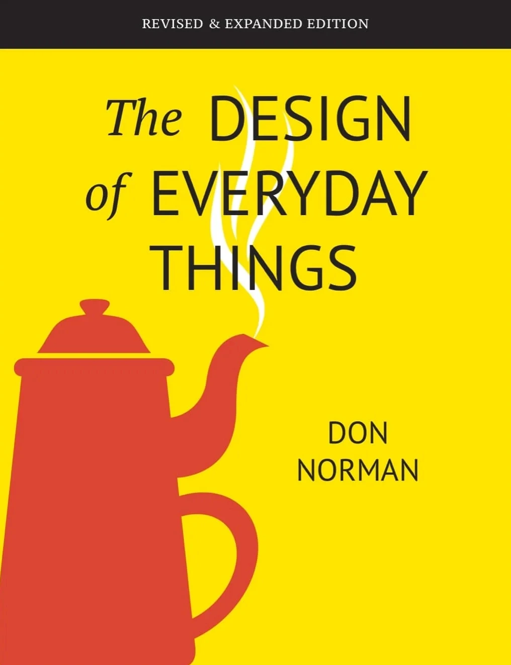
Norman convinced me that when something feels hard to use, it's rarely my fault, it's the design's. Every object should explain itself at a glance. I've never looked at a bad door handle the same way since.

Proof that wit and rigor aren't opposites in design. Every spread made me laugh and then quietly steal a note. Cleverness, used carefully, might be one of the most generous things a designer can offer.

Albers doesn't teach color theory so much as stage an ambush: the same color looks different depending on what surrounds it. I've never trusted a swatch in isolation since; every decision now happens in context.
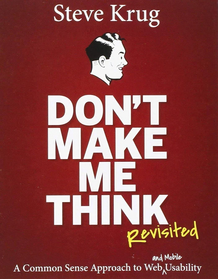
The whole book collapses into one instinct: if a user has to stop and think about how something works, it's already broken. I hold every screen I design to that same test: can someone use it on autopilot?

I keep this nearby like a manual for instincts I already had but couldn't name. Good design is obvious, great design is transparent: a line I quietly test every interface against before shipping it.

Subtract the obvious, add the meaningful. Maeda's core law sounds almost too simple until you try applying it under pressure. It's become a quiet gut-check whenever a design starts collecting features nobody actually asked for.

Müller-Brockmann treats the grid like a quiet discipline, a structure that lets content breathe instead of shouting for attention. Reading it changed how I see whitespace: not empty space, but the thing holding everything else together.

Norman's follow-up convinced me usability was never the whole story; people fall for objects that make them feel something first. It reframed early work of mine that optimized for function and forgot to make anyone feel anything.
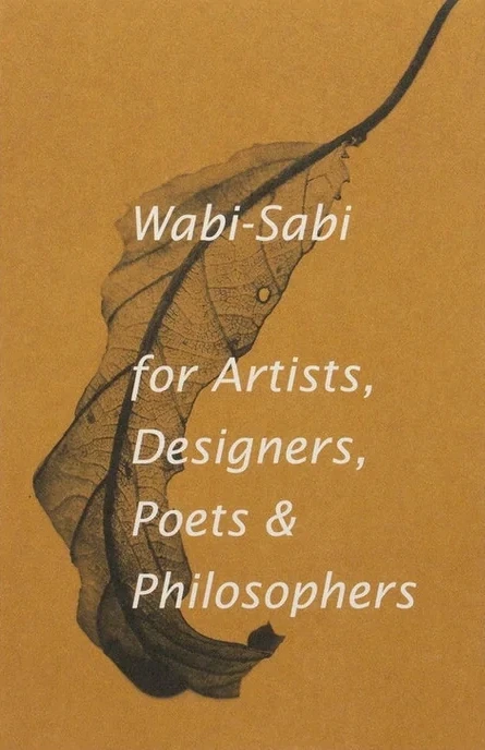
A tiny book that rewired something bigger than design in me. The beauty of things imperfect, impermanent, and incomplete felt like permission to stop chasing a polish that never actually existed in the first place.

Design is the silent ambassador of your brand, Rand wrote, and it stuck with me long after I closed the book. Every choice, a logo, a layout, either builds trust or quietly erodes it.

A short, disarming book that gave me permission to stop pretending originality comes from nowhere. Nothing is original, only remixed with intention, and that took a lot of pressure off the work that followed.

The book that taught me the four principles before I knew they had names: contrast, repetition, alignment, proximity. Simple enough to hand to anyone, and I still run work through that same checklist years later.
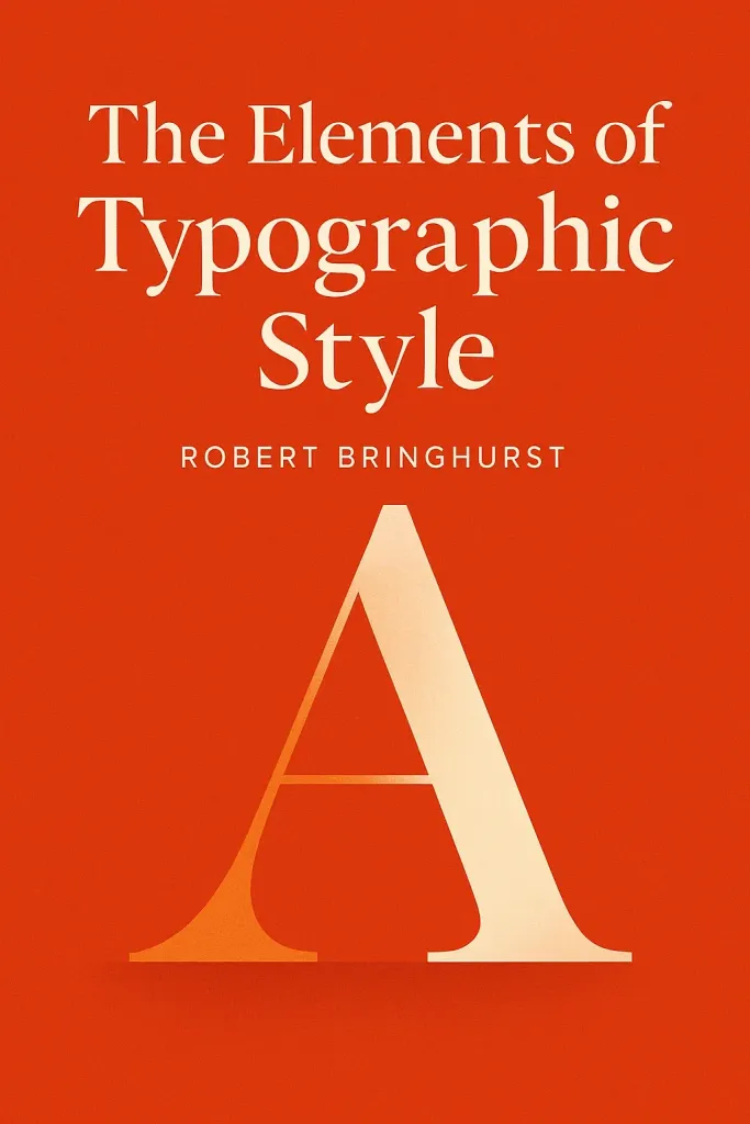
Bringhurst writes about type the way someone writes about music: rhythm, pacing, silence. His line that typography exists to honor content reset my approach: type should disappear into the reading, never announce itself.

Technically architecture, but I read it as design in disguise. No pattern is an isolated entity: everything good is built from smaller, proven pieces working together. It quietly shows up in how I structure systems now.
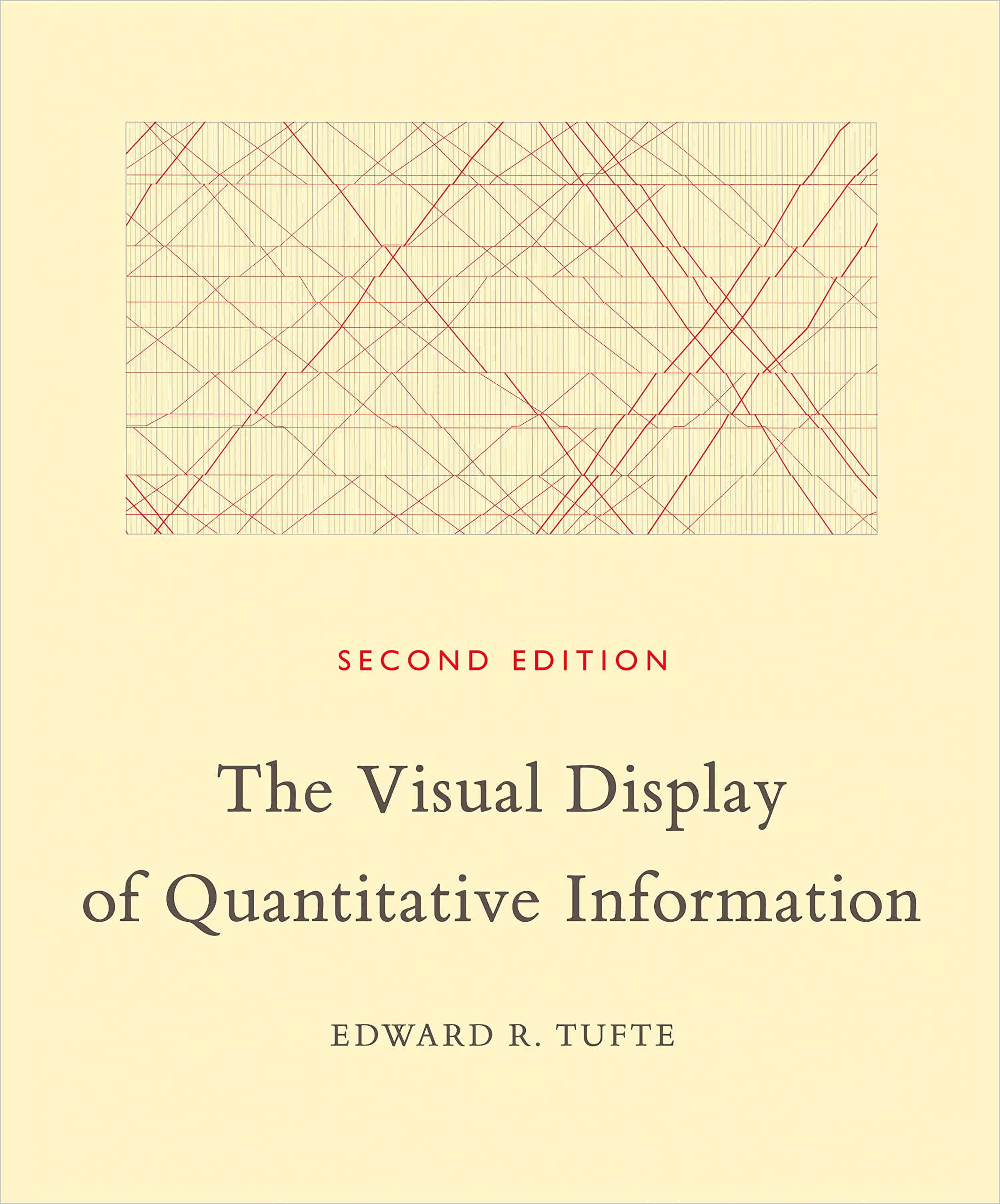
Tufte's insistence that a chart should show the data, and nothing but the data, still governs every dashboard I touch. Above all else, show the data: a sentence that quietly haunts every chart I build.
Norman convinced me that when something feels hard to use, it's rarely my fault, it's the design's. Every object should explain itself at a glance. I've never looked at a bad door handle the same way since.
Design is the silent ambassador of your brand, Rand wrote, and it stuck with me long after I closed the book. Every choice, a logo, a layout, either builds trust or quietly erodes it.
I keep this nearby like a manual for instincts I already had but couldn't name. Good design is obvious, great design is transparent: a line I quietly test every interface against before shipping it.
Technically architecture, but I read it as design in disguise. No pattern is an isolated entity: everything good is built from smaller, proven pieces working together. It quietly shows up in how I structure systems now.
A tiny book that rewired something bigger than design in me. The beauty of things imperfect, impermanent, and incomplete felt like permission to stop chasing a polish that never actually existed in the first place.
The whole book collapses into one instinct: if a user has to stop and think about how something works, it's already broken. I hold every screen I design to that same test: can someone use it on autopilot?
Bringhurst writes about type the way someone writes about music: rhythm, pacing, silence. His line that typography exists to honor content reset my approach: type should disappear into the reading, never announce itself.
Norman's follow-up convinced me usability was never the whole story; people fall for objects that make them feel something first. It reframed early work of mine that optimized for function and forgot to make anyone feel anything.
Albers doesn't teach color theory so much as stage an ambush: the same color looks different depending on what surrounds it. I've never trusted a swatch in isolation since; every decision now happens in context.
The book that taught me the four principles before I knew they had names: contrast, repetition, alignment, proximity. Simple enough to hand to anyone, and I still run work through that same checklist years later.
Müller-Brockmann treats the grid like a quiet discipline, a structure that lets content breathe instead of shouting for attention. Reading it changed how I see whitespace: not empty space, but the thing holding everything else together.
Proof that wit and rigor aren't opposites in design. Every spread made me laugh and then quietly steal a note. Cleverness, used carefully, might be one of the most generous things a designer can offer.
A short, disarming book that gave me permission to stop pretending originality comes from nowhere. Nothing is original, only remixed with intention, and that took a lot of pressure off the work that followed.
Subtract the obvious, add the meaningful. Maeda's core law sounds almost too simple until you try applying it under pressure. It's become a quiet gut-check whenever a design starts collecting features nobody actually asked for.
Tufte's insistence that a chart should show the data, and nothing but the data, still governs every dashboard I touch. Above all else, show the data: a sentence that quietly haunts every chart I build.
Norman convinced me that when something feels hard to use, it's rarely my fault, it's the design's. Every object should explain itself at a glance. I've never looked at a bad door handle the same way since.
Bringhurst writes about type the way someone writes about music: rhythm, pacing, silence. His line that typography exists to honor content reset my approach: type should disappear into the reading, never announce itself.
A short, disarming book that gave me permission to stop pretending originality comes from nowhere. Nothing is original, only remixed with intention, and that took a lot of pressure off the work that followed.
A tiny book that rewired something bigger than design in me. The beauty of things imperfect, impermanent, and incomplete felt like permission to stop chasing a polish that never actually existed in the first place.
The whole book collapses into one instinct: if a user has to stop and think about how something works, it's already broken. I hold every screen I design to that same test: can someone use it on autopilot?
Proof that wit and rigor aren't opposites in design. Every spread made me laugh and then quietly steal a note. Cleverness, used carefully, might be one of the most generous things a designer can offer.
Technically architecture, but I read it as design in disguise. No pattern is an isolated entity: everything good is built from smaller, proven pieces working together. It quietly shows up in how I structure systems now.
The book that taught me the four principles before I knew they had names: contrast, repetition, alignment, proximity. Simple enough to hand to anyone, and I still run work through that same checklist years later.
Müller-Brockmann treats the grid like a quiet discipline, a structure that lets content breathe instead of shouting for attention. Reading it changed how I see whitespace: not empty space, but the thing holding everything else together.
I keep this nearby like a manual for instincts I already had but couldn't name. Good design is obvious, great design is transparent: a line I quietly test every interface against before shipping it.
Albers doesn't teach color theory so much as stage an ambush: the same color looks different depending on what surrounds it. I've never trusted a swatch in isolation since; every decision now happens in context.
Tufte's insistence that a chart should show the data, and nothing but the data, still governs every dashboard I touch. Above all else, show the data: a sentence that quietly haunts every chart I build.
Design is the silent ambassador of your brand, Rand wrote, and it stuck with me long after I closed the book. Every choice, a logo, a layout, either builds trust or quietly erodes it.
Norman's follow-up convinced me usability was never the whole story; people fall for objects that make them feel something first. It reframed early work of mine that optimized for function and forgot to make anyone feel anything.
Subtract the obvious, add the meaningful. Maeda's core law sounds almost too simple until you try applying it under pressure. It's become a quiet gut-check whenever a design starts collecting features nobody actually asked for.
Norman convinced me that when something feels hard to use, it's rarely my fault, it's the design's. Every object should explain itself at a glance. I've never looked at a bad door handle the same way since.
Müller-Brockmann treats the grid like a quiet discipline, a structure that lets content breathe instead of shouting for attention. Reading it changed how I see whitespace: not empty space, but the thing holding everything else together.
Bringhurst writes about type the way someone writes about music: rhythm, pacing, silence. His line that typography exists to honor content reset my approach: type should disappear into the reading, never announce itself.
I keep this nearby like a manual for instincts I already had but couldn't name. Good design is obvious, great design is transparent: a line I quietly test every interface against before shipping it.
A short, disarming book that gave me permission to stop pretending originality comes from nowhere. Nothing is original, only remixed with intention, and that took a lot of pressure off the work that followed.
Albers doesn't teach color theory so much as stage an ambush: the same color looks different depending on what surrounds it. I've never trusted a swatch in isolation since; every decision now happens in context.
A tiny book that rewired something bigger than design in me. The beauty of things imperfect, impermanent, and incomplete felt like permission to stop chasing a polish that never actually existed in the first place.
Tufte's insistence that a chart should show the data, and nothing but the data, still governs every dashboard I touch. Above all else, show the data: a sentence that quietly haunts every chart I build.
The whole book collapses into one instinct: if a user has to stop and think about how something works, it's already broken. I hold every screen I design to that same test: can someone use it on autopilot?
Design is the silent ambassador of your brand, Rand wrote, and it stuck with me long after I closed the book. Every choice, a logo, a layout, either builds trust or quietly erodes it.
Proof that wit and rigor aren't opposites in design. Every spread made me laugh and then quietly steal a note. Cleverness, used carefully, might be one of the most generous things a designer can offer.
Norman's follow-up convinced me usability was never the whole story; people fall for objects that make them feel something first. It reframed early work of mine that optimized for function and forgot to make anyone feel anything.
Technically architecture, but I read it as design in disguise. No pattern is an isolated entity: everything good is built from smaller, proven pieces working together. It quietly shows up in how I structure systems now.
Subtract the obvious, add the meaningful. Maeda's core law sounds almost too simple until you try applying it under pressure. It's become a quiet gut-check whenever a design starts collecting features nobody actually asked for.
The book that taught me the four principles before I knew they had names: contrast, repetition, alignment, proximity. Simple enough to hand to anyone, and I still run work through that same checklist years later.