Brand
Staffbase
My Role
Senior Designer
Year
2026
Software
01
The brief
Staffbase had just rebranded its intranet and wanted a stronger internal identity built around the theme of CAMP. Town Hall would become Campfire, Onboarding would become Basecamp, and the internal app would become Campsite, the naming was already locked in when the project reached me. I designed the visual identity that holds it all together: the CAMP symbol, the lockups, the app icon, and the motion assets. What did not exist was a way to make four names feel like one family. So the real question was not what Campfire should look like. It was: what single shape can carry all four names, survive being shrunk to an app icon, and still read as Staffbase?
02
Looking inward before drawing anything


03
Shaping the symbol
Extracting the triangle was the easy part. The raw tail is tuned for the letter A in the Staffbase wordmark, so it had to sit inside the A of BASECAMP, CAMPFIRE and CAMPSITE without breaking the rhythm of the type, and still hold up alone as an icon. I ran it through a wide set of geometric variations, testing each one twice: isolated, then set inside the wordmark at real size. Two came out ahead on clarity, symbolism and scale.

04
Testing visual directions, and killing one
One colour per entity solves today’s problem and creates next year’s. The obvious colour move was one per entity: blue for Basecamp, orange for Campfire. It works, and I built the full set to see it properly. Then I asked what happens when the fifth entity arrives, and the sixth. A one-colour-per-entity system runs out of distinct colours fast, and every addition either muddies the set or gets a leftover colour that means nothing. The gradient had no ceiling, and it matched the updated Staffbase visual language. I killed the colour-coded version because it solved today’s problem and created next year’s.

Refinement rounds one and two
The first version was deliberately plain: a solid gradient triangle inside the A, across all four names, plus lockups with the Staffbase logo to test how parent and system sat together. Seeing all four together confirmed the system worked, and exposed the problem; a plain triangle is a triangle. The camp idea only lands because the word next to it says CAMP. The first attempt at making it read as a tent was a small orange flag at the peak. It gave the symbol character at large sizes, broke the silhouette at small ones, and introduced a second colour that fought the gradient. The second attempt kept the flag and added crossed camp poles, which did the job the flag was reaching for, structurally rather than decoratively.


07
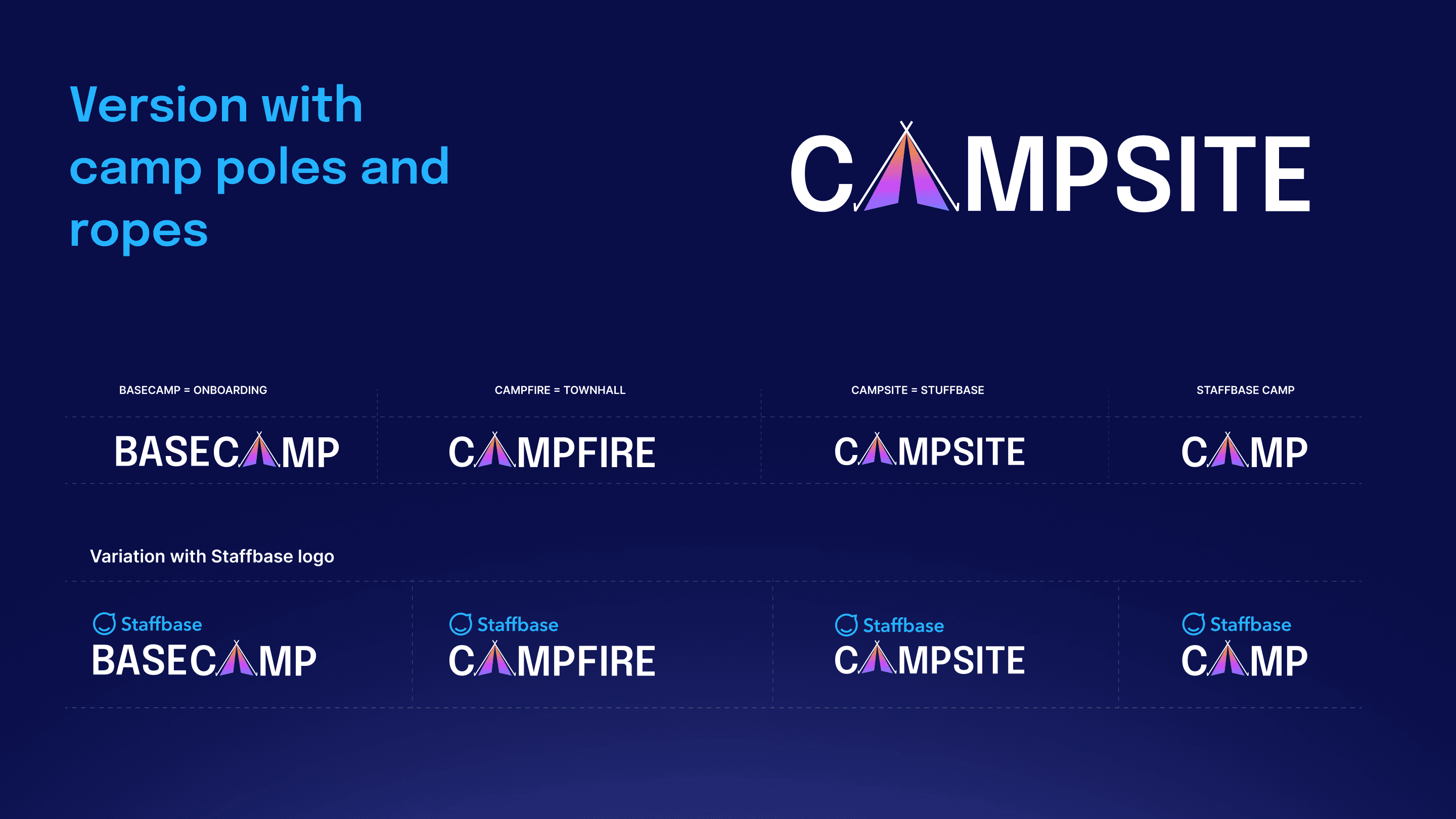
Refinement round 3: poles and ropes
This is the version that made it. Round three dropped the flag and built the tent from the poles alone, with a thin rope line down each side of the gradient face. It holds inside the wordmark, works as a standalone mark, and at small sizes the poles are the first thing you recognise.
08
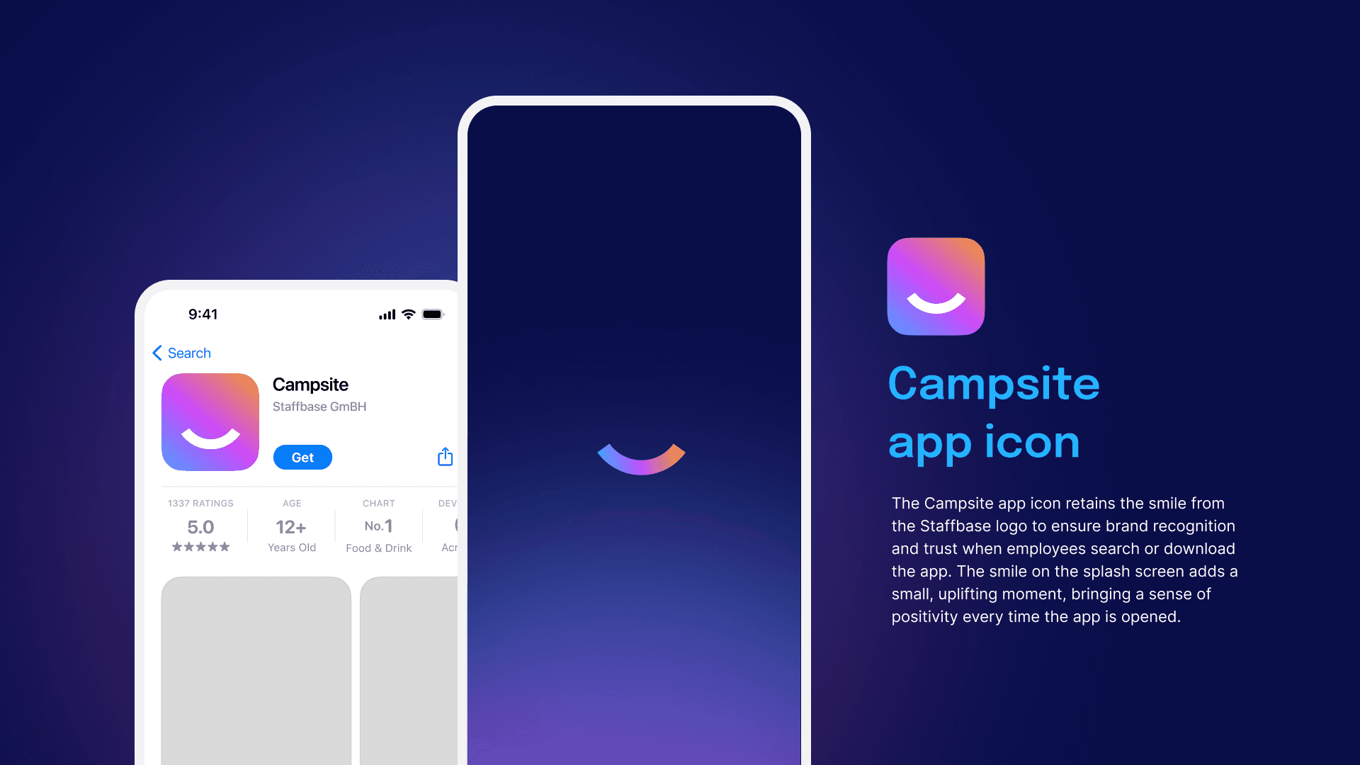
The app icon, and the round trip


09
Putting it into the intranet


10
Motion
The origin story is the most convincing argument for the whole system. I animated the construction because watching the bubble tail separate and become a tent explains in four seconds what a slide takes a paragraph to say. Everything shipped on solid and transparent backgrounds, so the team could use it in decks, Campsite posts and event screens without coming back to me for a new file.

11
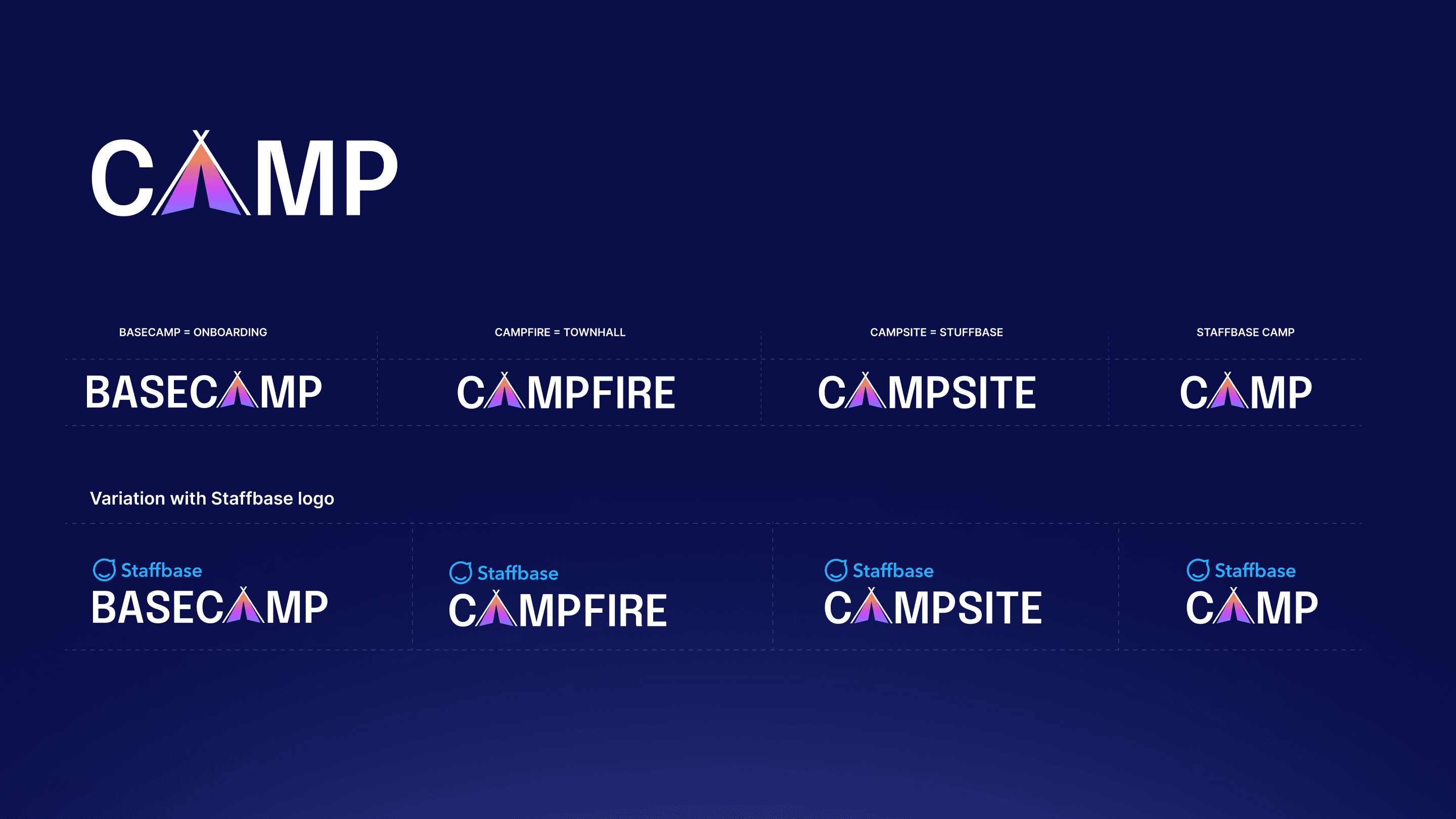
The final system
Four names, one symbol, one gradient. A set of lockups that work with or without the Staffbase mark above them. I handed over production files in dark and light for every entity, so anyone in the company could pull the right logo without coming back to design.
12
Outcome
The shape was already in the logo. The work was not inventing a symbol, it was noticing one, then spending three rounds making sure it could carry four names, a nav bar, an app icon and whatever internal comms adds next.